Wednesday, 20 January 2016
Flatplan Deconstruction
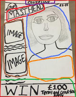
This is a flatplan of what my magazine may look like. I used this edition of the 'We heart Pop' magazine for inspiration. As you can see, I have outlined the features put into my own flatplan. First of all, I have drawn the model on the right hand side of the magazine in a similar way to how Cheryl Cole is placed on the magazine. This is highlighted in the blue pen. I have drawn the model in a way that it looks like a mid-shot just how Cheryl is posing and I have left a significant amount of space under the drawing of the model to place her name and a pull quote just how it has been done in the pop magazine. This has been outlined in the orange pen. I outlined the cover line in the purple pen and the masthead is outlined in red pen as I have placed it round about in the same area as the pop magazine. Last but not least, I have included some extra features on the bottom just like the Cheryl Cole magazine and that's outlined in green and on the left hand side of the front cover, there are images and coverlines/captions to go with them which I have also interpreted into my own flatplan which is outlined in the brown pen.
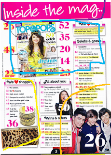 My contents page is also quite similar to the existing pop magazine as I used some of it as inspiration however, I didn't add a lot of the things from the pop magazine to my flatplan. I have used the purple pen to outline the masthead which is at the top and the biggest font on the page. I then used the blue pen to outline the image, numbers and text I will add to the left hand side of the page and I did the same with the orange and yellow pen.
Finally, this is my flatplan of a double page spread. I used this double page spread with Miley Cyrus on it, for inspiration. Although it doesn't look quite similar to the real magazine, I picked out some features that I liked and interpreted them into my own. I drew my model against the wall or sitting down just like Miley Cyrus as I thought this was a unique style and I outlined this in a purple pen. I put the masthead above the model and made it the biggest font on the page just like the real magazine. I outlined this in pink and outlined the text on the page with a red pen but I will also add a couple more images.
Thursday, 14 January 2016
Visual Moodboard
This is a time-lapse video I made showing words that came to my mind when thinking about my chosen genre, pop. The words that came to mind were: BRIGHT, VIVID, BOLD, EYE-CATCHING, TRENDY, GOSSIP, FASHION, BEAUTY, UNISEX AND COLOUR. I will need to consider these words when creating my magazine so that my magazine is unique and reflects the genre well.
Tuesday, 12 January 2016
Artist Profile
Monday, 11 January 2016
Fashion Images of Pop Artists
The first thing I noticed was that female pop artists are usually put in front of the masthead to make them the centre of attraction. In this one, Katy Perry is accessorised and placed in front of the masthead, making it harder to read. There isn't much text placed around her and she seems like the main focus. The angle of gaze is straight at the audience, making the front cover eye-catching and more personal. Her name is in the largest size again making her the most important person on the front cover. The other text around her is quite small, making it less important. The spacing is used quite well however, she seems like the only thing that matters to the readers so text is very minimal. The colour scheme is also very consistent and not too over the top.
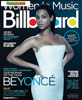 In another edition of the Billboard magazine, Beyonce is put in front of the masthead, making her the focus. Her angle of gaze is straight at the camera, making people pick up the magazine. Again, her name is the largest text on the page apart from the masthead, making her the centre of attraction. The colour scheme is also quite consistent on this magazine but her name is the only text that is an ombre shade making it stand out.
 On this one, it is almost impossible to read the masthead unless you are familiar with it. Taylor Swift's angle of gaze is straight at the camera and her whole outfit is on show, making her stand out. Also, the fact that she is in front of the masthead, it makes her the main focus. Her name is not the largest text on this magazine however, the way she poses is very eye-catching. In my opinion, the spacing isn't used as well as it could've been as the puffs and coverlines are all the same size, making them less important. The colour scheme is very consistent as the same three colours have been used throughout.
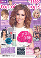
On this one, Chery Cole is smiling and again, she is in front of the masthead, making her stand out. Her 'big' hair is very eye-catching as well as her wide smile. She is the main focus of the page as all the other celebrities are smaller in size and therefore, less important. There are only a limited amount of colours used on this page such as pink, purple, black and white. Overall, these front covers can inspire me with my production work as I can incorporate many of the features into my own magazine.

Many pop artists wear fashionable, bright coloured clothing which usually reveals some of the artist's skin and body. Most of the accessories worn by the artists match the outfit for example Katy Perry has green hair which goes with the bright green sequins on her outfit. Ariana Grande is also wearing a black, cat-eared headband to match her black sequins outfit and Miley Cyrus has her nails painted red and her lip colour is also a bright red which matches the red sequins on her outfit. Most of these outfits are short and the artists' legs are on show, which attracts a lot of people. Overall, the outfits worn by pop artists are quite bright, eye-catching and revealing.
Tuesday, 5 January 2016
Market Research- Pop Music Videos and Analysis
This is Katy Perry's song, 'California Girls.' This video is the perfect example which relates and shows the link to the genre of pop. In this video, colours are being played with and the whole atmosphere is bright, relating to the bright theme usually in pop music videos. In pop music, it is all about the way the artist is dressed as well as the atmosphere around them but the music isn't noticed as much. Katy Perry wears outfits made out of candy, making the video seem quite childlike at the beginning where she seems really happy when licking an ice cream.There are also animated gummy bears in the music video and Perry's expressions link well with the upbeat music. However, as the video proceeds, the gummy bears swear and Katy is wearing nothing in one scene making it jump from suitable for young teenagers to PG as explicit scenes are shown. Snoop Dogg also features in this video and he wears a candy suit relating to the whole theme too. The overall lighting and colours of the video are really bright and fits to the theme and beat of the song which is quite upbeat and fast.
This is Taylor Swift's song, 'We are Never ever getting back Together.' This video is really different compared to Katy Perry's 'California Girls' as it is a bit slower but still has a fast, upbeat tune. The lighting is a bit dull and not many bright colours are used in the video however, at the beginning, Swift's outfit has some bright colours and the setting of the room has random pop of colour such as a red cushion and her lip colour is also red, making it stand out and literally 'pop' out to the audience. At the end of the video, there is party held at her house where the lighting is even duller but some people are wearing outfits with bright colours and playful costumes relating to the pop culture and genre quite well. Taylor's expressions are not too over the top or exaggerated although they are very clear. The video is her talking about her experience with a tune and beat to accompany her speech which is a creative way to reach the audience and this in itself is quite unique and pops out to the audience as its different from all the other pop music videos.
This is Meghan Trainor's song, 'Lips are Movin' and this is a very upbeat and eye-catching video. The lighting is very bright and the colours used are also very bright. At the beginning, the mic is painted red which is the main colour used throughout the pop genre. The video also consists of some real pop art such as big red lips and this has a link to the genre a lot. Also, Meghan changes her outfit a lot throughout the video and most of them are brightly coloured and one of her skirts is multi-coloured and striped, relating to the genre. Everyone else in the video are also wearing bright coloured clothing and Meghan's nails are also painted red. At the end of the video, there are other images with the colours red and pink used to make the video eye-catching. The whole set is brightly coloured and attractive and most of the colours pop. Overall, it is a very bright and fun video.
Audience Research (2) - Interview
Here is an interview I carried out with a 19 year old female. In my opinion, interviews are more personal and the interviewee is more prone to speaking their opinion as done in this video as I think a focus group might affect the views or opinions of the other people present. I think she was a good person to interview as she fits into my target audience well. The three main questions I asked were: which magazine appeals to you the most and why, what features are appealing/less appealing to you and why and what conventions can you notice. The overall opinion I collated was that Pop magazines are eye-catching and stand out the most when compared to other magazines of different genres which in this case were Hip-Hop and Rock. She also mentioned that Hip-Hop magazines are not her preferred genre because the female models have to be sexualised or objectified to be noticed and the Rock magazine wasn't too intriguing. She said that the colour scheme of the Pop magazine was the best as well as the layout because the colours used were vibrant and the spacing was used quite effectively. She noticed that the main conventions were that the masthead was very bold and bright and that the all artists portrayed on the front cover were the main focus or centre of attention. This has helped me with my research as I found out that Pop magazines were more popular compared to other magazines.
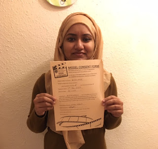 Here is the model's consent form.
Sunday, 3 January 2016
Audience Research (1) - Online Survey and Analysis
The first question I asked my audience was: 'Do you read or buy magazines? If yes, why? If no, why?' In my opinion, this was a useful question to ask as I now know if people do read or buy magazines and the reason for their purchase. 50% of my audience said that they do not read magazines as it does not interest them, 20% said they do read magazines in general as they are interesting, 10% said they read one online instead, another 10% said that they don't like reading as it bores them and the remaining 10% said that they do like reading magazines to find out about new artists or something new about the genre they prefer.
From this question, I found that over half of my audience do not even read magazines and so I will need to consider the remaining opinions from my audience in order for my magazine to be successful. I chose to customize this question into a rows format so that it would be clear to me which option/ opinion got the most votes.
From this, I can see the exact amount of votes for each option and the percentage for each choice making it easier for me to interpret this information when creating my own Pop music magazine.
The second question I asked was: 'What is the main thing that stands out to you when buying a music magazine?' This question was useful to ask because I could gain an understanding of what is eye-catching to people when they buy magazines and this way I can adapt the chosen conventions to match my genre and to make my magazine a successful one. Around 30% of my audience said the colour scheme of a magazine is the feature that stands out most to them when buying a magazine. Around 50% of my audience said that the image on the front cover was the eye-catching thing and the remaining 10% chose other where they did not specify what it was.
This shows the exact percentage of votes for each option and the option that has the most votes will help me decide what to put on my own magazine and how to make it stand out to my audience.
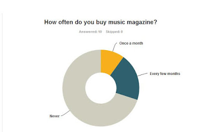
The third question I asked my audience was: 'how often do you buy music magazines?' This is a good question to ask as it can give me a general idea of how many people buy magazines and how often they buy it. As you can see from the pie chart, the majority of my audience never buy magazines whereas some buy one every few months and a couple buy one once a month. The reason for people not buying magazines may be that they do not have time to buy one so due to advancements in technology, magazines can be read online for free which also saves time.
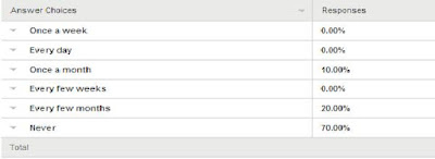 This quantitative data shows how many people buy magazines out of the total number of responses and how often they buy a music magazine. This has made it clear that many people from my audience do not usually buy magazines and so I will need to consider this when making my own magazine as I want mine to be unique.
The fourth question I asked was: 'What feature on a magazine is less appealing to you?' This was a very useful question to ask as this would help me with my production work. By asking my audience what feature they didn't like or notice that much, I can incorporate these opinions into my own magazine to make mine more appealing and eye-catching. From this data, I can see that the masthead is the feature that is less appealing to the audience as it doesn't really matter what the magazine is named, as long as it somewhat relates to the genre. People also said that the quality of images does not matter to them whereas 10% voted for the image on the front cover, another 10% for the layout and the remaining 10% for the content or stories on the front page. This has helped me gain an idea about what not to include in my magazine and to make my magazine appealing to my target audience.
This shows me that many people have various opinions on what they think is the least appealing feature on a music magazine. From this, I can see that people don't really bother with the title (masthead) but more with the content and stories on the magazine and so I may need to follow the basic conventions to make my magazine successful.
The fifth and last question I asked my audience was: 'What do you expect to see on a pop music magazine?' This question is the most important question I asked as I could gain a better understanding of what my target audience would expect to see on my magazine. My magazine could be successful if I put these features into my own magazine as it would be what my audience would be expecting and this way, my magazine will be appealing. The most votes were for random colours and by this I meant a limited number of bright colours used on the front page which you wouldn't normally expect to see on a Hip-Hop or R&B magazine such as pink and yellow.
This shows that many people do not expect to see an artist of the specific gender as no one voted for a male artist or a female artist meaning. Another feature that people do not expect to see on a pop magazine is dark colours which is quite obvious and so to make my magazine successful, I will need to follow these simple conventions. Last but not least, people expect to see top songs and artists on a pop magazine and so I will need to consider this when creating my own pop music magazine.
Market Research- Pop Magazines
Subscribe to:
Comments
(
Atom
)


