Friday, 18 March 2016

Thursday, 17 March 2016
DPS Stand First
Here is a powerpoint showing how I conducted my research for existing stand firsts and my attempt at writing my own. I adapted similar features from existing ones to my own to make my stand first eye catching and recognisable as a pop music magazine stand first.
Contents Page Colour Choices
Here is a powerpoint on the colour choices I made for my contents page. I used the same colours from the front cover on my contents page to make it consistent and make the two pages link together.
Monday, 29 February 2016
Contents Page Layout
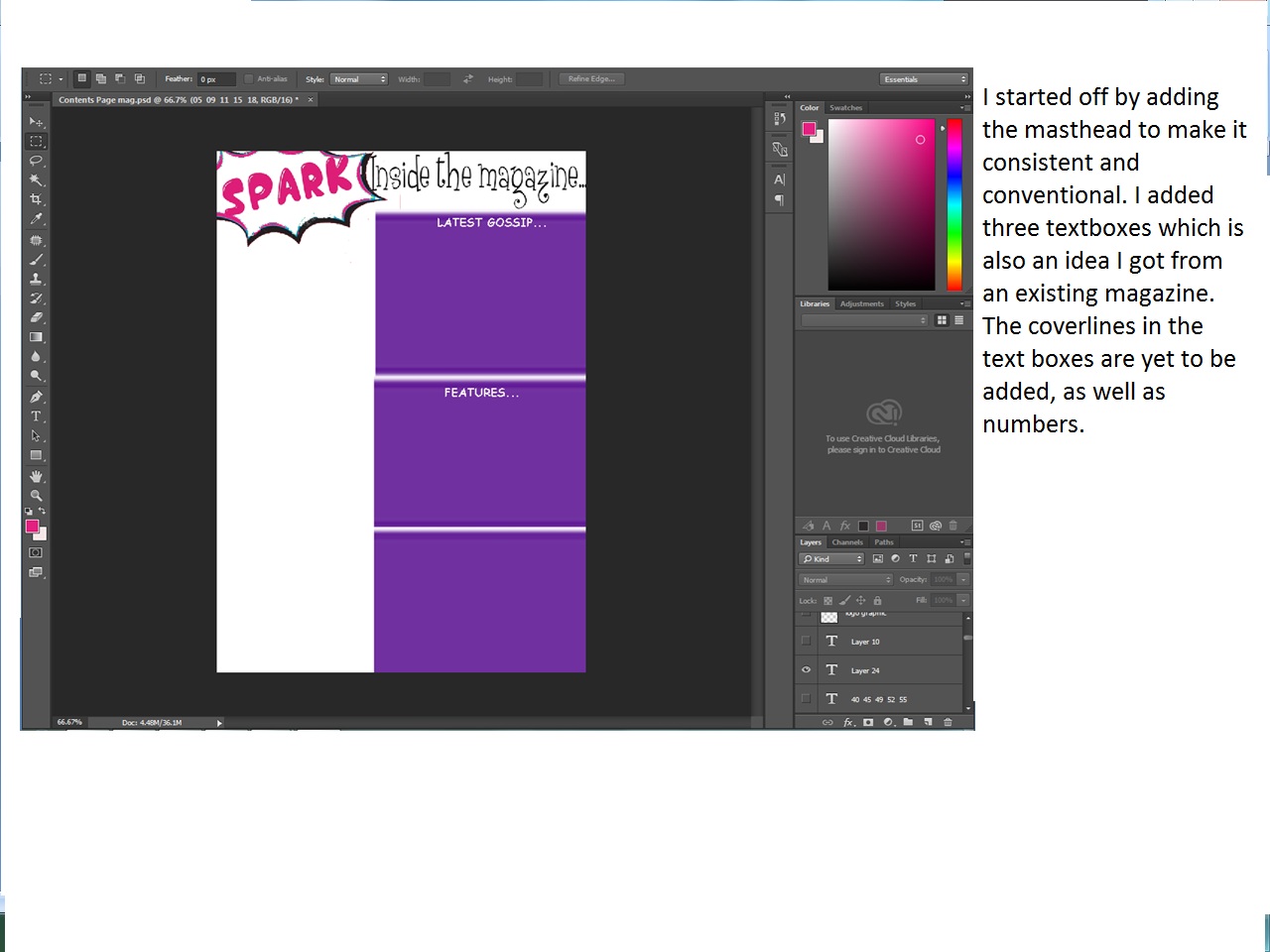 These images show the process of my contents page. I have outlined what I added and changed in order for it to look consistent and link to the front cover.

Contents Page Image Choices
Here is a video I made on Stupeflix which shows all the test shots I took for my contents page. Most of the images are suitable for the contents page as they are mid-shots. Although the model is in black clothing, the red lipstick really stands out and is quite eye-catching so I think these images are still suitable for a pop magazine. The poses are creative and unique and the lighting is very effective as it makes the model the centre of attention. The third image is one of my favourite as the pose is creative and the model has a wide smile which is very eye-catching. The eighth image is also my favourite because the lighting has created a shadow and the way the model's hair falls down is really unique. I will have to choose my image carefully because I have limited space on the contents page and I need it to fit in.
Subscribe to:
Posts
(
Atom
)