Tuesday, 5 January 2016

Audience Research (2) - Interview


Here is an interview I carried out with a 19 year old female. In my opinion, interviews are more personal and the interviewee is more prone to speaking their opinion as done in this video as I think a focus group might affect the views or opinions of the other people present. I think she was a good person to interview as she fits into my target audience well. The three main questions I asked were: which magazine appeals to you the most and why, what features are appealing/less appealing to you and why and what conventions can you notice. The overall opinion I collated was that Pop magazines are eye-catching and stand out the most when compared to other magazines of different genres which in this case were Hip-Hop and Rock. She also mentioned that Hip-Hop magazines are not her preferred genre because the female models have to be sexualised or objectified to be noticed and the Rock magazine wasn't too intriguing. She said that the colour scheme of the Pop magazine was the best as well as the layout because the colours used were vibrant and the spacing was used quite effectively. She noticed that the main conventions were that the masthead was very bold and bright and that the all artists portrayed on the front cover were the main focus or centre of attention. This has helped me with my research as I found out that Pop magazines were more popular compared to other magazines.
Here is the model's consent form.


Sunday, 3 January 2016

Audience Research (1) - Online Survey and Analysis

To carry out my survey, I used Survey Monkey to gain opinions from a group of people that I contacted via Facebook and text message. I got a total number of 10 responses and this way, I got a clear idea of what people think about Pop music magazines. I created a survey with 5 simple questions which consisted of both qualitative and quantitative data and from a limited number of questions I can get a general idea of what my target audience would and would not like to see on a Pop music magazine. I asked people from the age of 12-19 and by making the age range quite wide, I can gain a wider opinion on peoples' preferences.

 The first question I asked my audience was: 'Do you read or buy magazines? If yes, why? If no, why?' In my opinion, this was a useful question to ask as I now know if people do read or buy magazines and the reason for their purchase. 50% of my audience said that they do not read magazines as it does not interest them, 20% said they do read magazines in general as they are interesting, 10% said they read one online instead, another 10% said that they don't like reading as it bores them and the remaining 10% said that they do like reading magazines to find out about new artists or something new about the genre they prefer.


 From this question, I found that over half of my audience do not even read magazines and so I will need to consider the remaining opinions from my audience in order for my magazine to be successful. I chose to customize this question into a rows format so that it would be clear to me which option/ opinion got the most votes.


From this, I can see the exact amount of votes for each option and the percentage for each choice making it easier for me to interpret this information when creating my own Pop music magazine.


The second question I asked was: 'What is the main thing that stands out to you when buying a music magazine?' This question was useful to ask because I could gain an understanding of what is eye-catching to people when they buy magazines and this way I can adapt the chosen conventions to match my genre and to make my magazine a successful one. Around 30% of my audience said the colour scheme of a magazine is the feature that stands out most to them when buying a magazine. Around 50% of my audience said that the image on the front cover was the eye-catching thing and the remaining 10% chose other where they did not specify what it was.


This shows the exact percentage of votes for each option and the option that has the most votes will help me decide what to put on my own magazine and how to make it stand out to my audience.
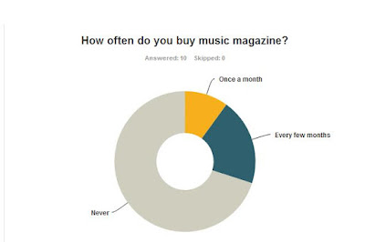

The third question I asked my audience was: 'how often do you buy music magazines?' This is a good question to ask as it can give me a general idea of how many people buy magazines and how often they buy it. As you can see from the pie chart, the majority of my audience never buy magazines whereas some buy one every few months and a couple buy one once a month. The reason for people not buying magazines may be that they do not have time to buy one so due to advancements in technology, magazines can be read online for free which also saves time.
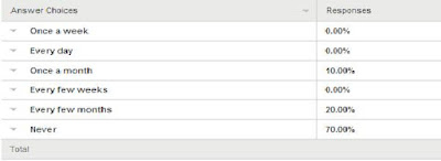
This quantitative data shows how many people buy magazines out of the total number of responses and how often they buy a music magazine. This has made it clear that many people from my audience do not usually buy magazines and so I will need to consider this when making my own magazine as I want mine to be unique.

The fourth question I asked was: 'What feature on a magazine is less appealing to you?' This was a very useful question to ask as this would help me with my production work. By asking my audience what feature they didn't like or notice that much, I can incorporate these opinions into my own magazine to make mine more appealing and eye-catching. From this data, I can see that the masthead is the feature that is less appealing to the audience as it doesn't really matter what the magazine is named, as long as it somewhat relates to the genre. People also said that the quality of images does not matter to them whereas 10% voted for the image on the front cover, another 10% for the layout and the remaining 10% for the content or stories on the front page. This has helped me gain an idea about what not to include in my magazine and to make my magazine appealing to my target audience.

This shows me that many people have various opinions on what they think is the least appealing feature on a music magazine. From this, I can see that people don't really bother with the title (masthead) but more with the content and stories on the magazine and so I may need to follow the basic conventions to make my magazine successful.


The fifth and last question I asked my audience was: 'What do you expect to see on a pop music magazine?' This question is the most important question I asked as I could gain a better understanding of what my target audience would expect to see on my magazine. My magazine could be successful if I put these features into my own magazine as it would be what my audience would be expecting and this way, my magazine will be appealing. The most votes were for random colours and by this I meant a limited number of  bright colours used on the front page which you wouldn't normally expect to see on a Hip-Hop or R&B magazine such as pink and yellow.

This shows that many people do not expect to see an artist of the specific gender as no one voted for a male artist or a female artist meaning. Another feature that people do not expect to see on a pop magazine is dark colours which is quite obvious and so to make my magazine successful, I will need to follow these simple conventions. Last but not least, people expect to see top songs and artists on a pop magazine and so I will need to consider this when creating my own pop music magazine.


Market Research- Pop Magazines

Here, I searched pop music magazine front covers on Google images and a variety of magazines showed up. This way, I can clearly spot the conventions of pop magazines and get a good look at what pop magazines should consist of. From this collection of images, I can see that all pop magazines have bright colours used on the  front cover and the models angle of gaze is straight at the camera. This makes the magazine more personal to the reader. This is a pull factor for the audience as it attracts them to read on. There isn't a fixed colour scheme as random colours are used and so when I come to making my own pop magazine, I will need to consider these conventions in order for my magazine to be successful. Previously, when I deconstructed a pop magazine, I noticed the same conventions which I will be incorporating in my own magazine. Another thing that really stands out is the model's name and this is usually put across the model itself to make it stand out and the main focus of the front cover. However, some of the anchors are put behind the artist but still placed effectively where the name can still be read. This is also something I will need to consider because I want my model and their name to stand out rather than any of the other features. I have also noticed that most pop magazines have female artists but also small pictures or information about different artists placed onto the front cover. Overall, I will need to look at more examples of pop magazines to familiarise myself with the conventions so that I can successfully put them into my own magazine.

Thursday, 17 December 2015

Pop Music Magazine Deconstruction

Here is a Glogster post which shows the deconstruction of a 'Top of the Pops' music magazine. I have talked about how the different features of a magazine have an effect on the reader and how they all work together to make it eye-catching. I talked the different fonts used, the range of colours, the angle of gaze, the effect of the masthead, the model on the front cover and what she wears and lastly, how puff words and cover lines attract readers.

Monday, 14 December 2015

Typography Visual Moodboard

Here is a mood board of all the types of mastheads used in a variety of music magazines. The conventions which I was able to visualise were that three basic colours, black, red and white, have been used consistently. I also saw that mastheads linked with rock music were plain black and the serif in these mastheads were exaggerated a lot. Whereas, the mastheads for pop magazines were far more eye-catching, although serif was not exaggerated. Many of these fonts have been manipulated for example most of the mastheads related to the pop genre are big in size and kind of imitate a bubble or the image of a bubble 'popping'. They are also full of colour to catch the target audiences' attention. However, mastheads linked to the genres of R&B, Indie e.t.c are usually a plain colour like black and are bold. Most rock music magazines on the other hand, have shadows behind them and are usually bold and underlined. The mastheads linked to rock or heavy metal music have the serif exaggerated in most places whereas other fonts don't. This way I was able to see the conventions and I can use these in my own magazine. I could look at more pop music magazine mastheads to give me an idea of what kind of masthead I will need to construct to attract my audience.

Research Rationale

Here is a prezi outlining my chosen genre and the types of research methods I will conduct to get both qualitative and quantitative data. In this prezi, I have outlined my target audience, the steps of how I will conduct my research and the resources I will need to carry out this research.

Sunday, 13 December 2015

Intro to Production Brief and Initial Ideas

I have been set a brief which is to create the front cover, contents page and double page spread of a music magazine. When I was first set this brief, I had many ideas going through my mind because I wasn't sure what genre my music magazine would be based upon. I do feel a little confident towards this brief as I have had experience with Photoshop during my preliminary task which was to create the front cover and contents page of a college magazine. However, I do feel quite nervous because my deadline is quite short and I will need to work hard to achieve the target. In the past, I enjoyed blogging about everything I did but I don't think I did enough of it and now I will need to change this as I will need to blog about every other change I make to my music magazine. Also, I don't read many music magazines so I am not quite familiar with the conventions of a specific music magazine. I have decided to make a Pop music magazine as that is the genre of music I usually listen to on a daily basis. I also like listening to R&B and Hip-Hop but I will stick to Pop because I am most familiar with this. I would've liked to challenge myself and create something new but I don't have much time and I am most comfortable with the Pop genre. I may need to spend my free time testing the other features on Photoshop and getting used to them so that when I come to the actual production work, I won't be confused and this way, time won't be wasted. One thing that worries me a lot is time management because my time management skills are quite poor. To overcome this problem, I will need to get used to some of the new features on Photoshop that I may be needing so that I can use them in my production work. I will also need to read more music magazines, in this case Pop, so that I can visualise different masthead fonts and the conventions needed to meet the specifications of the genre. I may choose to subvert from these conventions to make my magazine unique but I will conform to some of the basic conventions such as the font colours and the types of images used. Overall, I feel quite confident towards this brief and look forward to making a pop music magazine of my own.